ST. JULES
Noon
NOON was born out of a simple question: Why is the most important meal of the day also the most skipped?
As people get busier and sit-down breakfasts become a thing of the past, they increasingly reach for convenient, nutritious foods — at all hours of the day, not just mornings. But the breakfast category hasn't kept up: it's still marketing sit-down morning meals. So we created NOON: Breakfast for whenever, wherever and whyever. And we started to dismantle the category conventions one by one.
We developed every aspect of the NOON brand, including the strategy, positioning, name, brand identity, packaging and go-to-market campaign.
Retail Ready Design
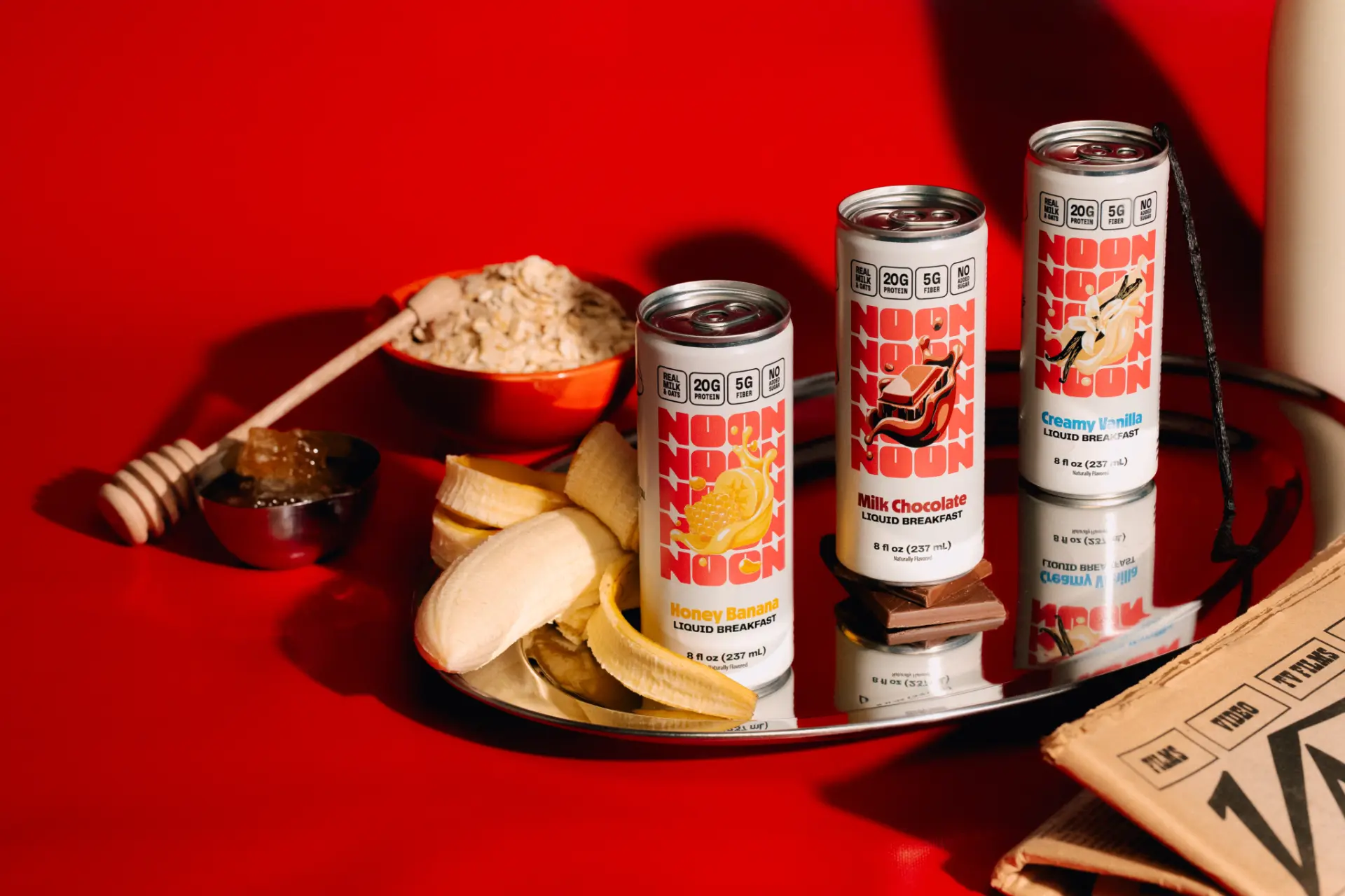
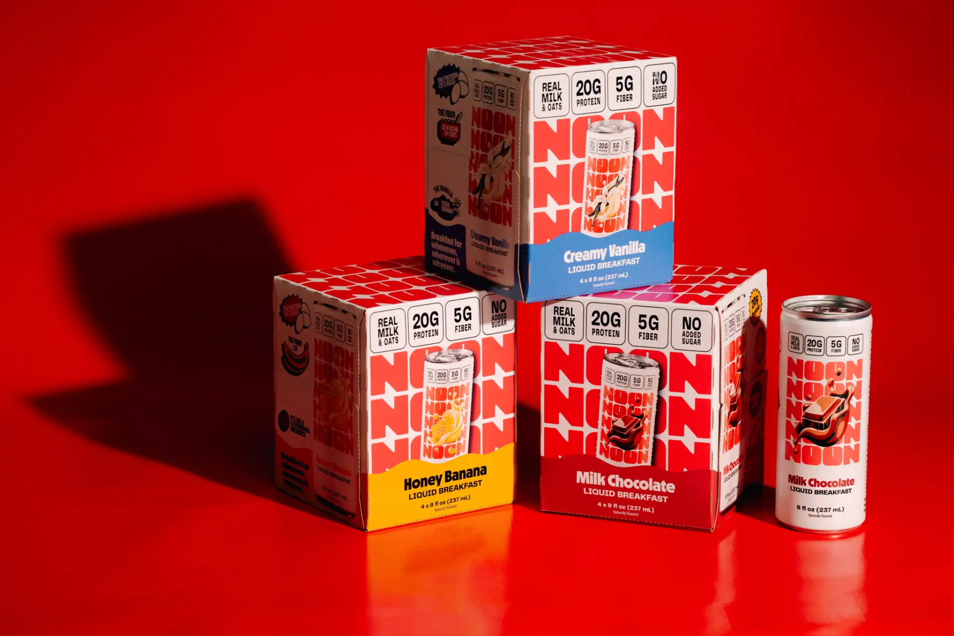
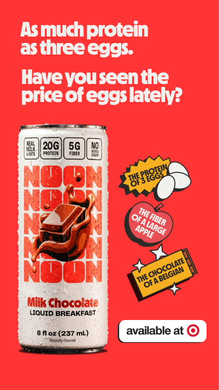
Many startup CPG brands create beautiful minimalist branding and launch into DTC. Then they have to completely rethink their packaging when they go into retail. Our design system was developed specifically to cut through in retail: NOON needed to be clearly visible from 6ft away, and the flavors needed to be easily visible from 1ft away.
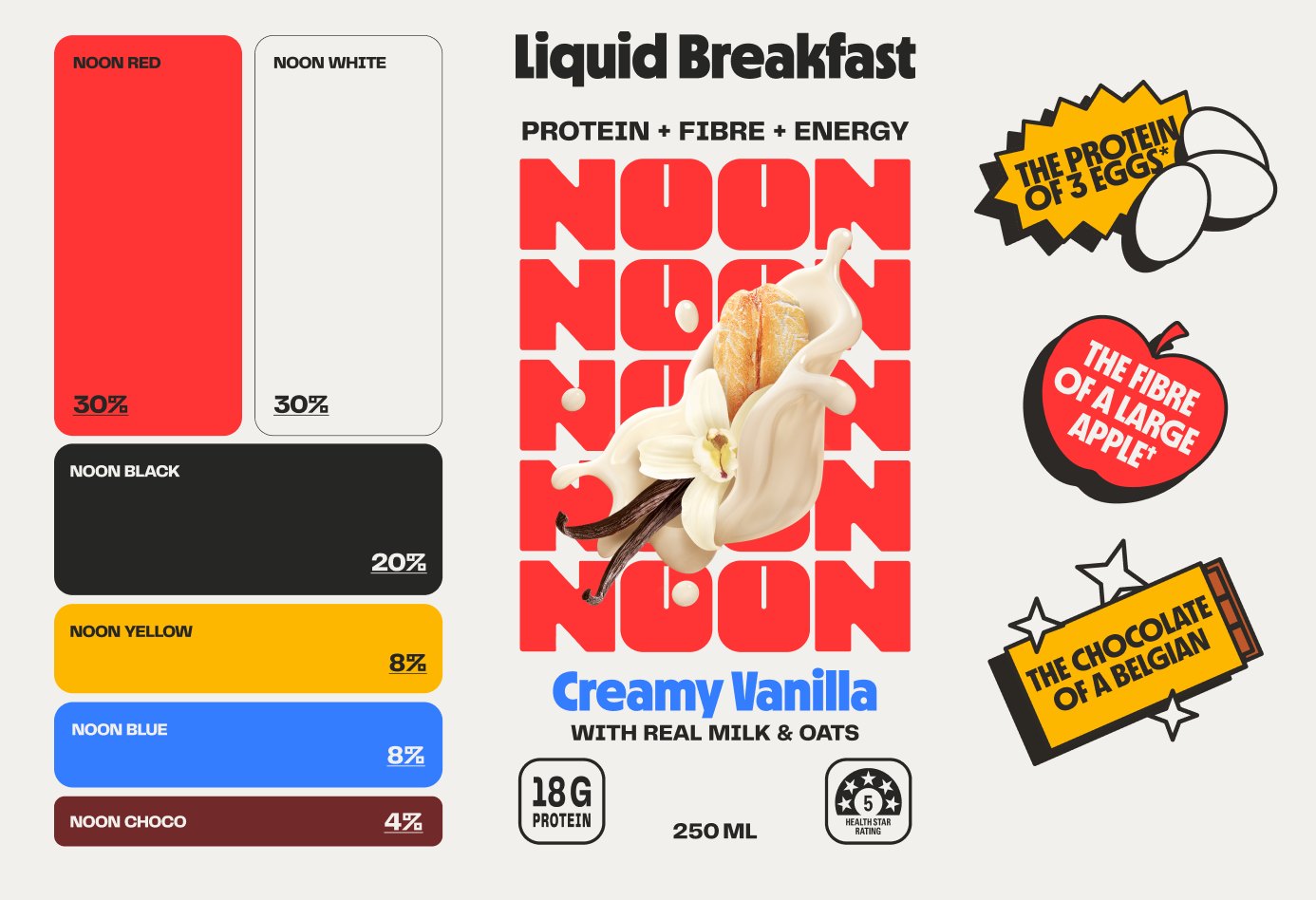
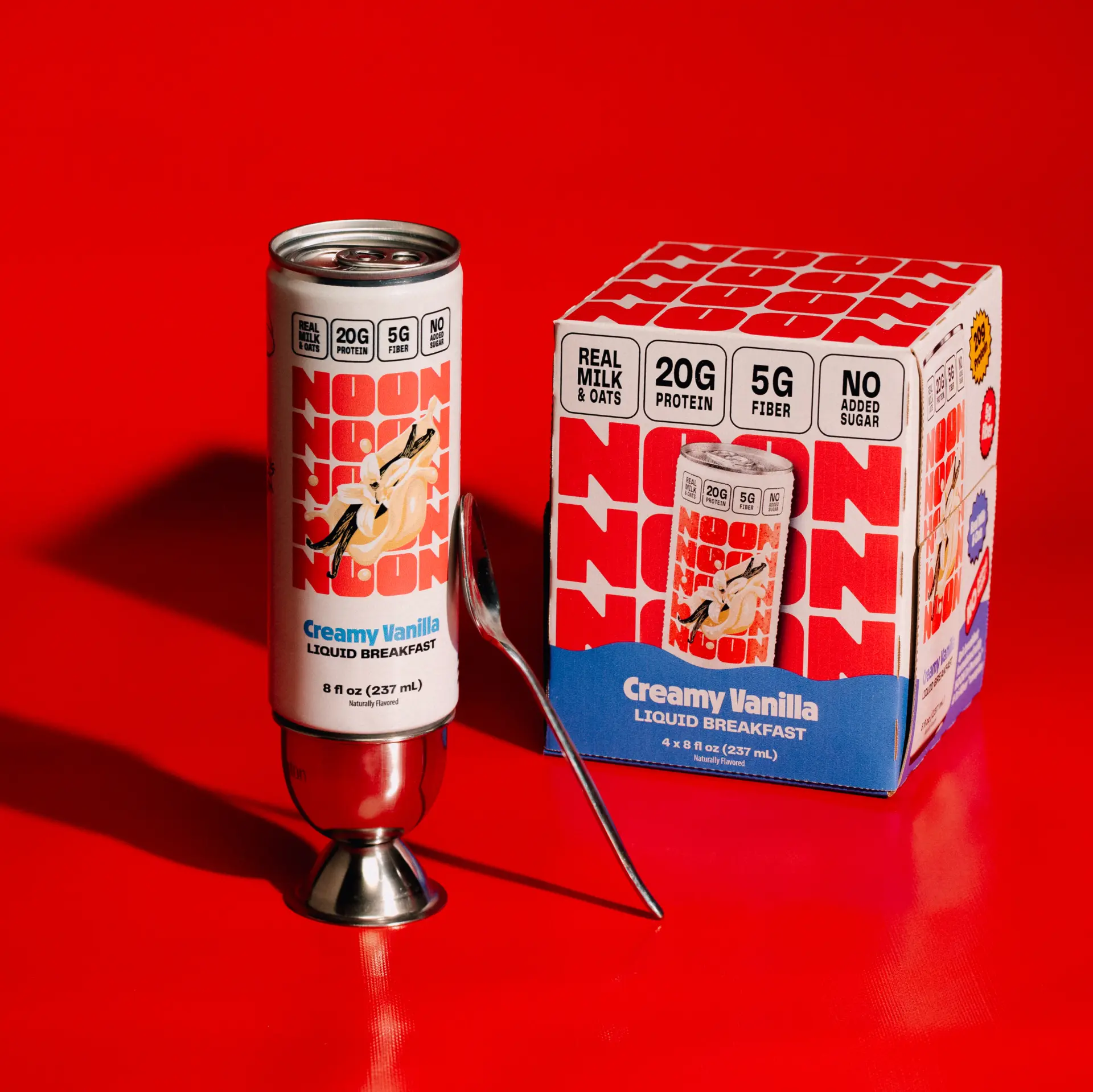
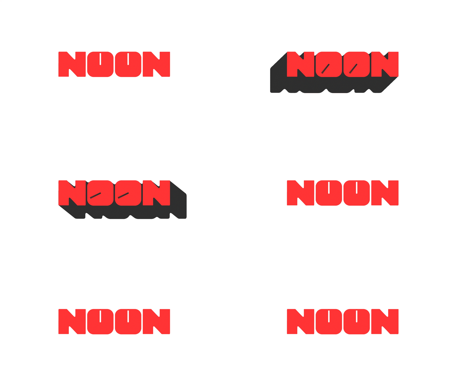
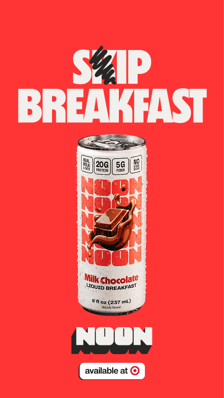
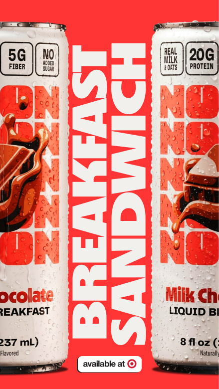
Our simple grid system prioritized color blocking, stacked our logo and could scale into any packaging format. By using our logo as a pattern, we can repeat it as many times as we like.
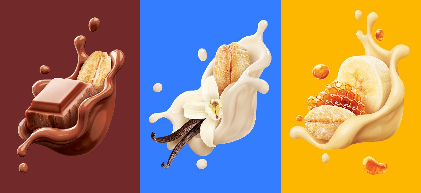
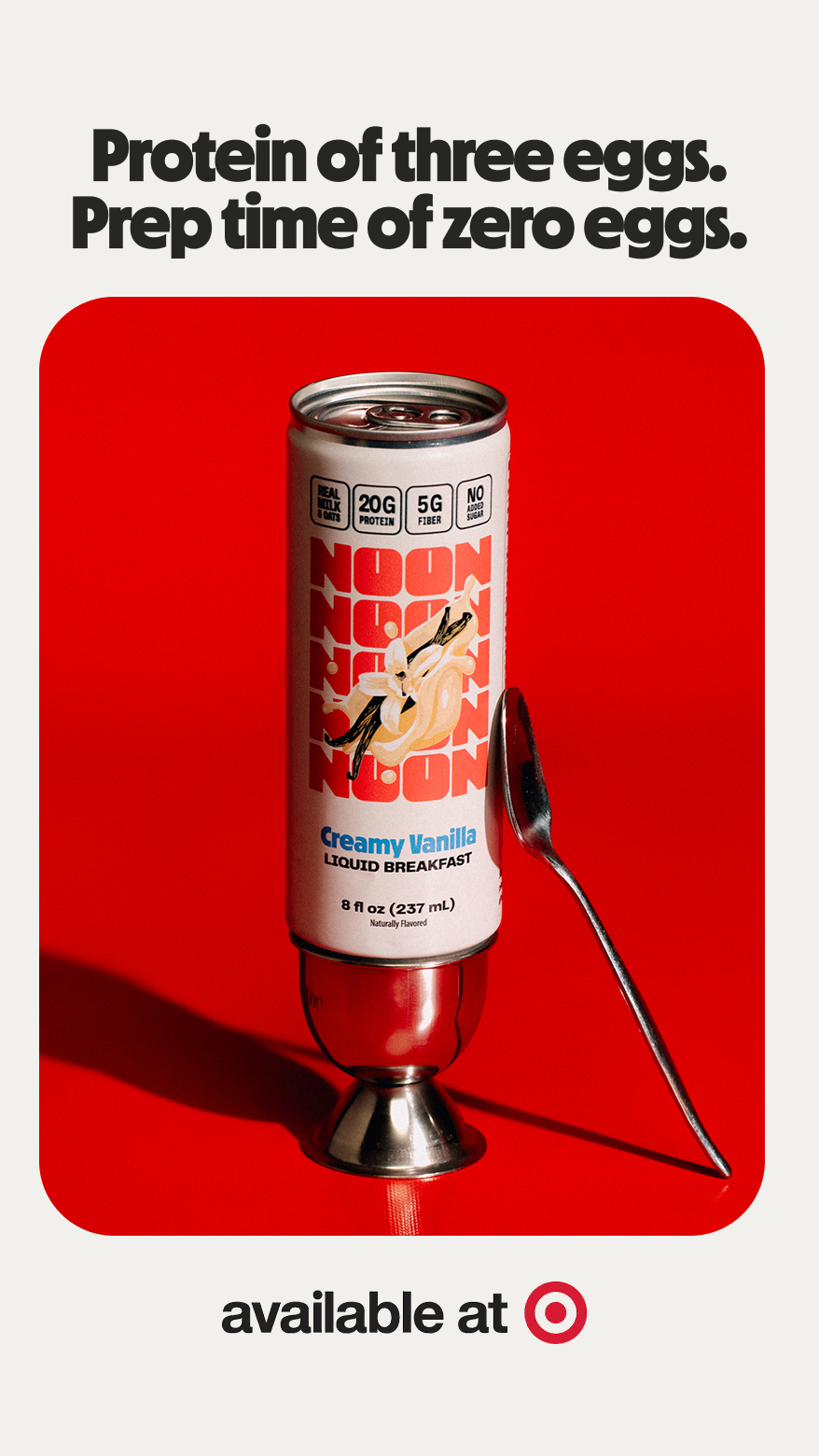
Our ingredients “float” on front of pack, using a mix of photography and 3D rendering to create a hyperreal style that maximizes appetite appeal. This style gives depth and modernity to our otherwise 2D, almost retro design system.
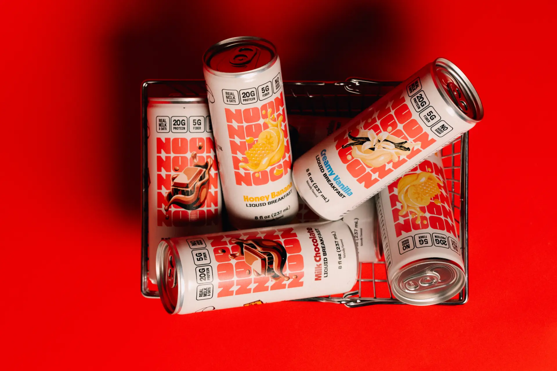
Combined, these elements create a packaging system that delivers on best practice, without falling victim to category convention.
The Weapon of Voice
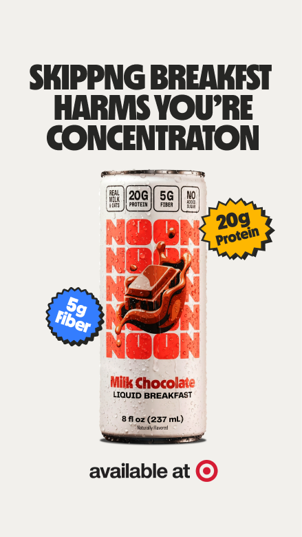
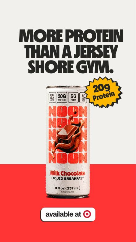
When you're launching a challenger brand against a 25yr incumbent, you can't be afraid to speak your mind. We developed a fearless brand voice that always said it straight — because our audience knows when they're being sold to. We also created a bizarre mascot named Mascot, who we occasionally wished would speak his mind less.
Collaborators
Design: Outro